Help Center
-
Knowledge Base
-
-
-
- Articles coming soon
-
- Home
- Install Settings
- Merchandising
- Personalize
- Category
- NLP
- Script-Hooks
- Analytics
- Manage Users
- Agentic Search (AI-Powered Conversational Search)
- AI Synonyms
- Semantic Search
- AI Shop Assistant (Chat Widget)
- Recommendations Widget
- Advanced Filtering & Filter Trees
- Troubleshooting Guide
- Search Performance Optimization
- BigCommerce Search Integration
- WooCommerce Search Integration
- Getting Started with eCommerce Search
- Ecom Copilot (AI Sales Assistant)
- AI Filtering (Query Tagging and Intent Classification)
- Visual Merchandising (Product Pinning)
- Geo Merchandising
- A/B Testing
- Showcase Products (Zero-Character Search)
- Delete Products from Search Index
- Landing Pages
- Autocomplete Configuration
- Popular Suggestion Queries
- Tab Views
- Theme Setup
- Search Bar Integration
- Search Redirects
- Advanced Configuration (Search Weights)
- Matching Options
- Connect BigCommerce
- GDPR and Privacy Settings (Cookie Consent)
- Image Search (Visual Search)
- Smart Notifications (Back-in-Stock and Price Drop Alerts)
- Leverage GA4 Data (Google Analytics 4 Integration)
- Manage Users (Dashboard Access and Permissions)
- Reporting Overview
- Show all articles (28) Collapse Articles
-
-
- Install Settings
- Analytics
- Search settings
- Merchandising
- Category
- NLP
- Search-API info
- Manage Users
- Script-Hooks
- Personalize
- Agentic Search (AI-Powered Conversational Search)
- AI Synonyms
- Semantic Search
- Recommendations Widget
- Advanced Filtering & Filter Trees
- Troubleshooting Guide
- Search Performance Optimization
- WooCommerce Search Integration
- Show all articles (3) Collapse Articles
-
-
- Instructions to install app
- Home
- Install Settings [Shopify]
- Category
- Merchandising
- Search settings
- NLP
- Analytics
- Search-API info
- Manage Users
- Script-Hooks
- Personalize
- Agentic Search (AI-Powered Conversational Search)
- AI Synonyms
- Semantic Search
- AI Shop Assistant (Chat Widget)
- Recommendations Widget
- Commerce MCP Server (Shopify AI Tools)
- Advanced Filtering & Filter Trees
- Troubleshooting Guide
- Search Performance Optimization
- Ecom Copilot (AI Sales Assistant)
- Search Bar Integration
- Search Redirects
- Metafields and Tags (Shopify)
- Product Bundles (Shopify)
- Collection Pages (Shopify)
- GDPR and Privacy Settings (Cookie Consent)
- Image Search (Visual Search)
- Smart Notifications (Back-in-Stock and Price Drop Alerts)
- Leverage GA4 Data (Google Analytics 4 Integration)
- Manage Users (Dashboard Access and Permissions)
- Reporting Overview
- Show all articles (18) Collapse Articles
-
- Getting started
- Installation Guide
- Magento 2 Search Integration - Adobe Commerce edition
- Commerce MCP Server (Shopify AI Tools)
- BigCommerce Search Integration
- WooCommerce Search Integration
- Getting Started with eCommerce Search
- Connect BigCommerce
- Domain Allowlist (WordPress)
- Leverage GA4 Data (Google Analytics 4 Integration)
-
- Articles coming soon
-
< Back
You are here:
Print
Responsive search box
Created On
Last Updated On
byExpertrec Marketing
The responsive search box gives you control to show different search boxes, one for mobile and one for desktop and choose when to display either based on a browser width which is called breakpoint.
Breakpoint– specify a browser width at which the desktop search changes into mobile search.
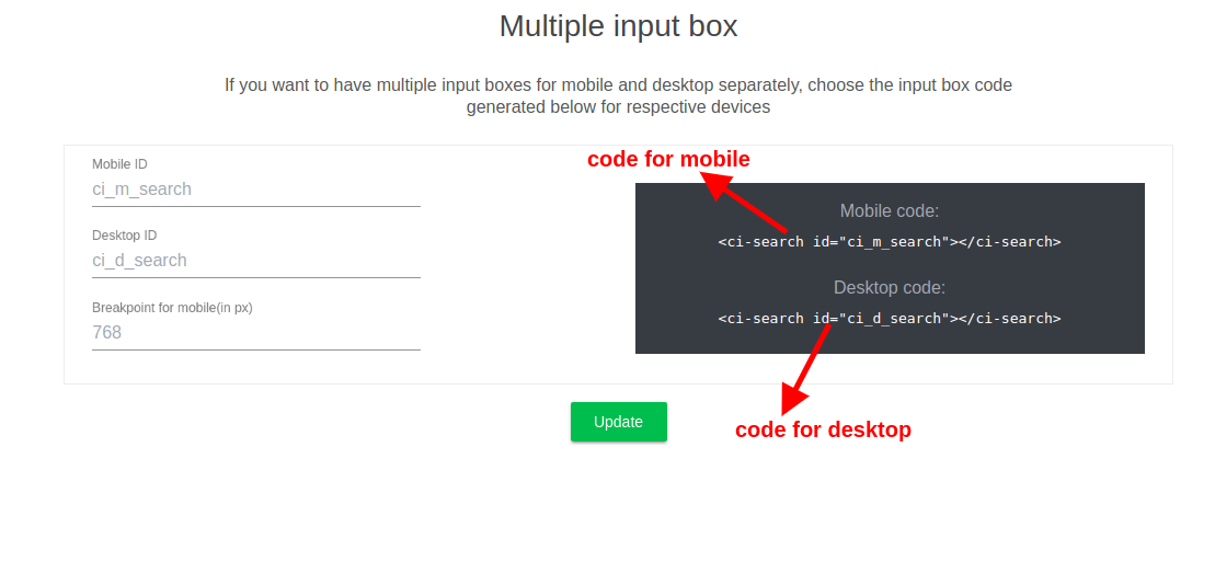
Here is an example illustrating this-
At 781px width, you can see the difference between mobile and desktop search UI in StackOverflow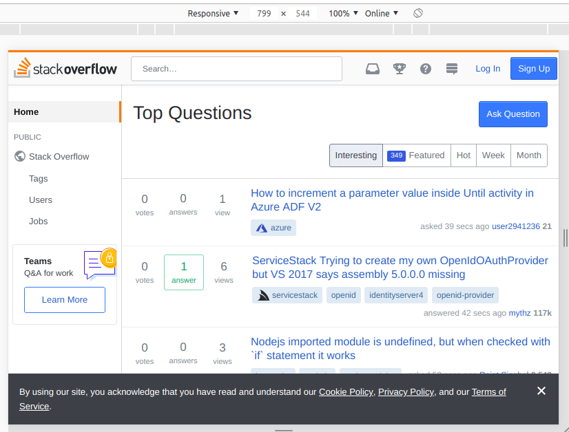
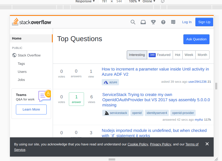
Table of Contents