Site search positioning is an easily ignored component of a website throughout the design process, even though consumers rely on it to access specific information. The user experience is greatly impacted by search bar design because it is one of the most utilized components on a website. This article will explain the ideal site search positioning that makes it easier for visitors to discover the information they are looking for.
Why Should Your Website Have a Search Bar?

Users can access information more quickly by using search bars, according to the psychology and logic underlying their use. Search bars are helpful in sophisticated, content-heavy websites with more than 100 pages. Large news sites, booking sites, and business-to-consumer (B2C) e-commerce sites employ search bars to make content easier to discover for consumers. Large Business to Business (B2B) websites with several client groups and product lines also employ them. A search bar might not be necessary for a tiny site with few pages, but you will need one as the site gets bigger.
Search Bar Designing and Positioning Tips for Better Engagement

Start by implementing these eight modifications to your site’s search functionality if you are ready to start boosting your online sales.
The techniques outlined below are highly effective at enhancing customer satisfaction and raising conversion rates.
So, let’s get going!
Position the Search Bar at Top of the Page:
Your website visitors should not have to hunt through your entire website to discover the search box. The website’s search box should be the first thing visitors see, allowing those who visit intending to make a specific purchase. These customers should reach their goal quickly by simply putting in the name of the item they wish to buy.
To ensure your search box is designed for maximum use, you need to evaluate where your expert design team can place it. Try positioning it in the Centre or on the left if the top of the page placement isn’t used often, to see if this makes it more obvious.
Make the Search Bar Prominent and Big:
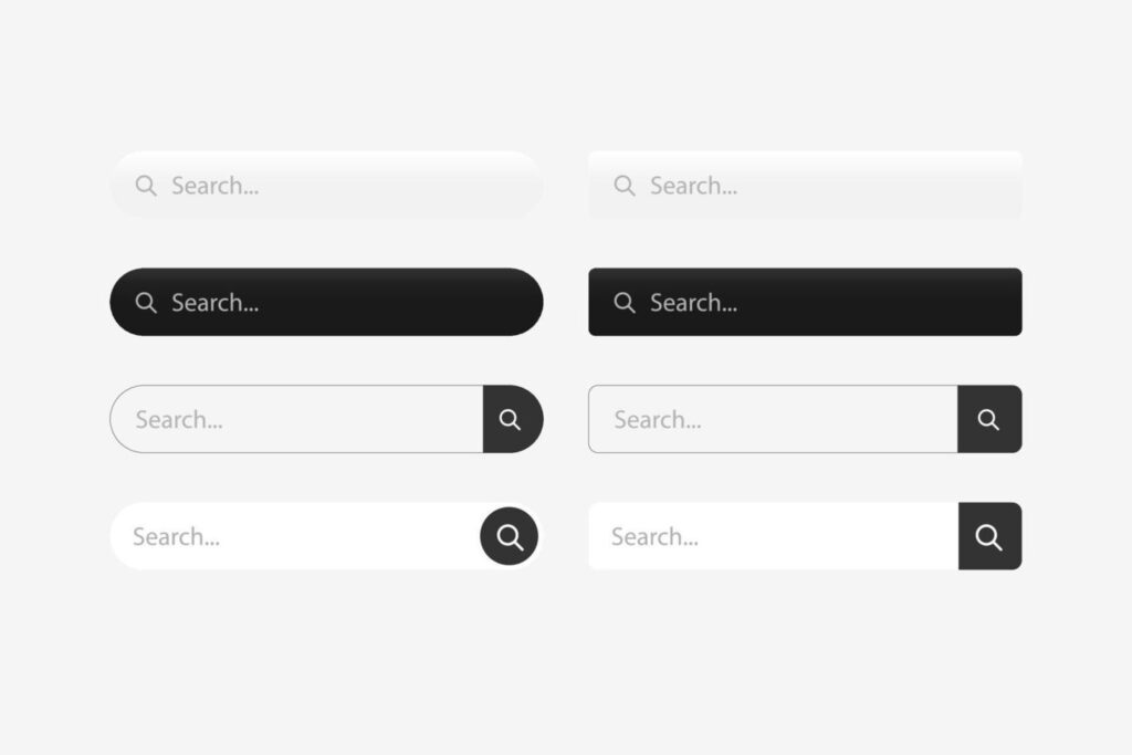
When more people utilize the search box, they are more likely to convert from visitors to buyers; therefore, make sure your search box is big and noticeable, so it’s easy to discover. Place your search box apart from other input fields so that people can easily identify it as such, and add some wording to the field, such as “Search” or “Enter items here”.
Ensure the search box has been prompted so users can quickly identify the fields they may search. Text that reads “Search by item number” might be useful, because most search engines enable you to do this.
Choose a large, clear font to make it easier for users to read your text prompts. While having these reminders is a nice idea, they should vanish as users click in the search field to avoid obstructing their search terms.
Implementing the Auto complete Feature:
Thanks to auto complete feature, users are provided with items and phrases as soon as they start typing. It can be especially useful for difficult-to-spell search words since it completes the user’s ideas by locating the appropriate keyword before they finish typing.
Users may access a product with only a few keystrokes and a click, which saves time and effort. Additionally, auto complete reduces typos too.
Add a Search Field to Each Page:
Since users will not need to go back to the home page to search, adding your search box on every page will enhance search usage. For people to know where to locate it, be sure you maintain it in the same location on every page.
Add a Search Box to the Search Engine Results Page’s bottom (SERP):
Since users won’t need to go back to the home page to search, adding your search box on every page will enhance search usage. As we previously stated, maintaining it in the same location on every page is advantageous, so customers don’t have to search for it.
Place it at the bottom of the SERP, or make it ‘sticky’ in addition to that. In this approach, customers who arrive at the SERP but decide they need to rephrase their inquiry after perusing the results page may do so quickly and efficiently without having to scroll back up.
Show Search History as References:
You may personalize your online store by saving users’ previous searches and utilizing them as recommendations when they visit your site again. They can easily continue where they left off, thanks to query prompts for previously searched terms.
Include easy controls if you decide to implement this function so consumers may, if they so want, erase previous searches. Make sure to highlight previously searched phrases in a different color than typical suggestions so consumers can immediately tell the difference.
Conversion rates will rise due to customers using the search box more often since it is more visible and easier to use, leading them straight to the item they are looking for.
Label the Search Button and Enable Search Execution Using the “Enter” Key:
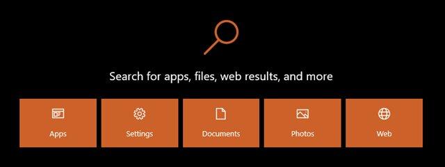
Label the search button prominently with the words ‘Search’, ‘Find’, or “Go” or with the icon of a magnifying glass, which represents search.
Let the ‘Enter’ key also initiate the search process in addition to prominently labeling the search button. It is ideal to meet this expectation as many users execute commands using the “Enter” key. This is quicker and simpler for the search user because their hands are already on the keyboard.
Conclusion
Site search positioning can be difficult because, as internet users, we are used to having this feature. The standard is high because it is likely that most of the websites you visit have mastered their search functionality. To be honest, even the most well-known websites are essentially a search interface.
Users feel lost if there are only navigation in the website and no search bar, as it is irritating to guess where they can find a product; it is time consuming too. Your search bar should be straightforward, obvious, and simple to use. Your users will not give it much thought if it functions correctly and saves their time. Doing this will keep their trust in your website and your company and get them one step closer to a conversion or purchase. So, basically employing a good design team is like a one-time investment that will give fruitful results for years!
Add great search to your website


