


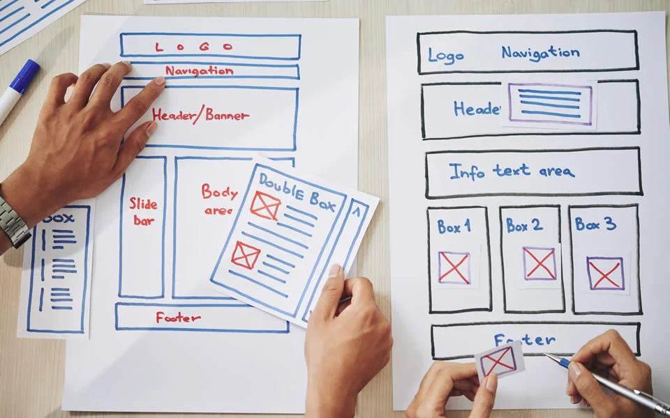
Websites are made of numerous web pages and the navigation menu is the one thing with keeps them connected. If your navigation menu does not work or, is not easily accessible, the users will be frustrated and not come back again. It will cause a huge difference in sales and conversion rates. So, website Navigation is a crucial feature for your website which cannot be ignored at any cost. But in this competitive market, you cannot just have a basic navigation menu and sit idle with it; you need to change it according to the market trends. Here are some tips, examples and best practices of Website navigability for your better understanding. Let’s get into it.
Some Tips For Website Navigability For A Smoother Usage Experience

Websites that are easily navigable help the users find the articles or resources they are looking for, giving them a good experience, and propelling them for a return. Follow these tips to make that happen-
Planning the Navigation with the Help of a Sitemap:
When clarifying which features your website needs, you need to decide in which hierarchy should they show up. To help that, a sitemap is created. It includes all the important items of the user interface and all its sub-categories, helping you to indicate which pages are main and which the viewers need or want access to. This helps the users understand your page’s strong points and attract them to certain things they might not have been interested in. Most of the time it is your best product, so the customer satisfaction rate will go up.
Sticking to the Conventional:
While it may be tempting for you to think outside the box and think of something very pleasant to look at, sometimes you’ll also need to look at what’s best for you and stick to basics for clarity over eye-pleasing aesthetics because you would want a smooth experience for viewers while letting your own identity as a website shine, so there should be a balance between both.
Limiting the Number of Things on Your Menu:
Keeping the menu minimal with a maximum of six to seven categories will help the users to understand and access whatever information they need quickly.
If your site has a lot of information, you can also sub-categorize them by using a drop-down menu so that visitors can choose from them.
Adding a Search Bar and Labeling Menu Clearly
While there may be a drop-down menu, having a search bar to search for products is really necessary for your website. If a website only contains a navigation menu, your buyers will be frustrated if they came to search for a specific thing. Place the search bar near your navigation menu so that customers can easily search for a thing if they cannot find it through navigation.
Labeling the Menus Clearly:
When labeling menus, it’s better to make sure that the text is easily decipherable, to the point, and not generic. Not all users are fluent in English, so using easier words will make them find their things quickly, avoiding them leaving your website.
Some Inspirational Website Navigation Examples

It’s always better to look at examples rather than a textbook or, in our case, article knowledge. We have listed some websites for a better understanding of their strategy. You can visit these sites and study them as a user to feel the user experience and employ it on your own one.
Punk Ave:
This agency has a navigation bar appearing on top of all the screens on the website. Along with the main concept, it also has a brief description of what users can find on the screen.
Their animations are short and subtly help to make the navigation experience very oriented for the users.
The website itself is small, so it’s great for companies that don’t have a lot of items or categories.
Politico:
If you have hundreds of items or pages that you need or have to account for, Politico’s expandable menu helps by filling the whole screen without any visuals to distract.
On the contrary, users can see a very well-designed, no-nonsense group of categories for the most important parts of the website.
Users here can find the content according to area, title, alphabet, and name, finding the content they want along with many options too.
Other Websites:
Along with the previous ones, you can also study these websites and note down your thoughts- ETQ, Alfa Charlie, and VERK.
Best Practices to Improve Website Navigability
Use a Mega Menu Instead of Numerous Drop-down Menus:
It’s better to not use a drop-down menu leading to another, what you can do is- use a ‘mega menu’ that shows a larger menu from the main navigation. This way the users would not be confused.
Check Both the Mobile View and Desktop View of Your Menus:
It is essential to check how your menu, aka its visuals, looks on different screen sizes, making sure long menus don’t take up a lot of space. Three-line icons are easier to recognize as a navigation menu bar, so using them will make the users find it quickly in your page.
Use Your Analytics for Improvement:
You can use Google Analytics to monitor the results, see what’s working for you and remove the icons or the lists that are not clicked or rarely clicked. You should also check how people are using your site and upgrade or update based on the results. Here are some ways in which you can do that-
- Rename the icons that are barely clicked upon
- Make the menu easier to navigate
- Move menu items that get a lot of clicks to the topmost or at the front
Improve Accessibility:
Websites should also consider people with visual impairments and make their websites user-Friendly for them too. Links should be properly labeled and legible, accessible to keyboard navigation and text readers. This way you can expand your audience. As web designing is continuously evolving, websites should be made keeping every kind of person in mind. If you make your website fancy but people with visual problems are unable to read it, it is not likely to show up when people will search for keywords that your website contains.
Wrapping Up
eCommerce is not just about attracting an audience, but making them come again as well as multiplying the number. You have to keep up with the market trends to make your website a preferred one in the Search Engine, in making visitors attracted to click, and keep revisiting for more. Sometimes small things affect your business, so always make room for improvement. Follow these tips to grow bigger in the future.


