We all know a successful brand is built on a well-designed website. If you want your brand to have an accessible and user-friendly design, good website navigation is a necessity. This is because visitors to your website will not hesitate to leave if they experience difficulties locating the information they require or navigating the site. Always try to focus so that visitors to your website won’t have to shift through much content to find a call to action if you keep it simple. Instead, they should get their required information immediately.
Let’s examine the significance of website navigation and some of the fundamentals of efficient navigation.
What is Website Smart Navigation?

Users can quickly and easily navigate a website using site navigation, as the name suggests. Simply put, it is a way for visitors to locate and explore various sections of a website.
There are two main stages to building a website. Web pages and everything they contain, including graphics, text, and buttons, as well as their behavior, are the primary focus of front-end components.
However, the majority of back-end website development concerns server-side issues. It turns out that browsing a website requires the expertise of a web developer because it is the primary development type function.
Why is Smart Navigation on Websites So Crucial?

Suppose your site doesn’t have a navigation system. In that case, your visitors won’t be able to find your website, email signup page, product listing, pricing, contact details, or help manuals.
Let’s begin with the following general statements:
On any page of your website, a customer should be able to easily find what they’re looking for in just three clicks using the navigational framework.
In a perfect world, each customer would most probably begin at your homepage and then go through your website. But in reality, this is untrue; however, visitors do navigate around a lot. Remember that you want visitors to your website to become your customers and want them to remain and browse around. By arousing their utmost zeal and tempting them with attractive offers, you can induce them to click on your website.
Find out More About the Connection Between Site Navigation and User Experience.
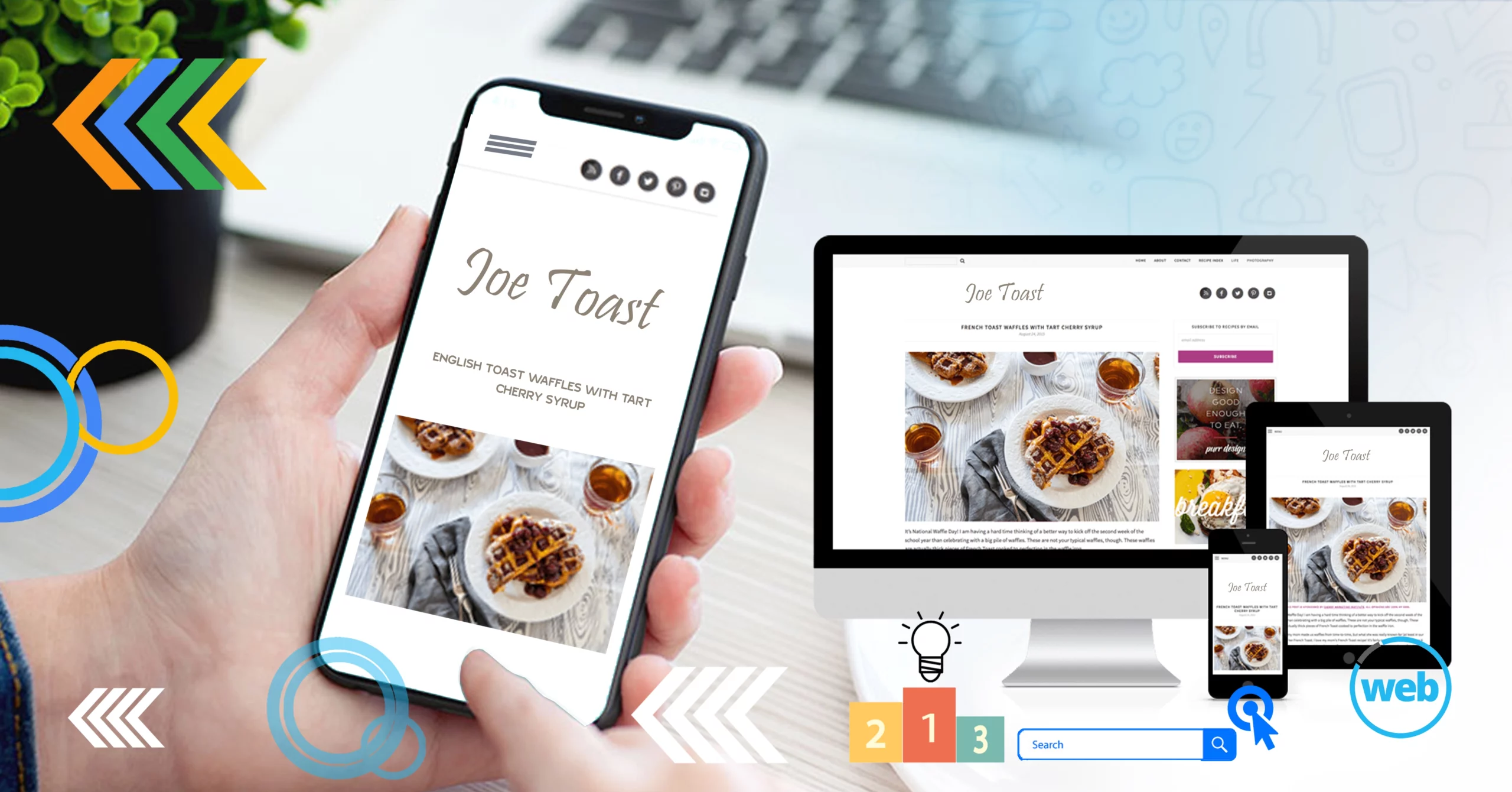
Users’ overall feel on your website’s usability and attractiveness is referred to as “user experience.” Everyone who sees your website should find it simple to utilize.
Several aspects of web design and development have an impact on user experience, including:
- Graphics, typefaces, and colors
- The title and CTA.
- Access to the location if possible
- Page loading speed
- Formal Design
However, how visitors will navigate through your website is among the most crucial factors to consider when developing or designing a website.
A website’s navigation makes it simple for users to switch between pages. If you’ve done a fantastic job, visitors who leave your site with the intention of returning, could even make a purchase or join your subscription. People can easily locate what they’re seeking because of so many websites they frequent daily. So, make sure to make the navigation process easy.
Important Pointers for Making a Website’s Navigation User-Friendly
The navigation menu is the first thing visitors to your website click to assist them in finding what they are looking for. Unfortunately, many websites have navigation that is badly designed. Although they do a good job guiding people, there is still some uncertainty.
To help you prevent this uncertainty, here are some navigational improvement ideas for your website.
Label Subcategories:
The navigation menu is an area that needs special attention if you want to create an intuitive website. To make searching easier, create a site navigation bar with separate categories, sections, and subsections. You need to title subsections that are relevant and useful for SEO.
Consistency is What Counts:
The layout and style of your website are completely within your creative control as the owner. However, retaining consistency and predictability is important to avoid user confusion.
Make sure the docker doesn’t alter when the visitor switches to other sites (if you want to place one on the side or top of the homepage). Although the look of the navigation bars can be customized, most users anticipate a website’s menu to look similar.
It’s Preferable if There are Few Menu Alternatives:
A decent website should typically have no more than eight menu items. This is so that they can decide whether to stay or go after simply browsing your website. It is important to maintain your content’s organization and categorization into several groups. A flawed decision-making process is caused by too many or too few categories.
Get Rid of Confusing Navigation Text and Titles:
Users leave websites because of poor navigation, inaccurate testing, and wrong route names. As they are perplexed, visitors won’t hesitate to go to the next website. To ensure that each page of your website has the right information, you must arrange your content before creating the navigation. Ensure that the language and graphics are used appropriately to reflect the website as well.
A Clickable Link Should be Made:
No matter how basic it may appear, drop-down menus and clickable links must be included in your site’s navigation section. By clicking on a subcategory, website users may now quickly access content on a particular page.
Final Thoughts
Navigation is one of the user experience’s most overlooked web design components. It is just blatantly ignored. Instead of copying other websites, merely because they look good, figure out which navigational aspects are most important to your brand and audience. Include links that cater to both groups’ requirements. Although you want individuals to take advantage of your offer and purchase your goods, your target market might not be prepared to do so just yet. Navigational links will give visitors different reasons to stay on your website. Using screenshots, audio recordings, and A/B testing can improve your site’s navigation and guarantee that your audience has the greatest experience possible while using it.
