In offline stores, imagine a scenario where you are checking out different stores to purchase a particular product. We often quickly scan through these products in the store until something grabs our attention. It could be a sign describing the product, the appealing product, or even the store’s atmosphere. The point is that something drew our attention to that particular store. This is exactly how Landing Pages attract visitors to your store.
Ecommerce landing pages are what captivate customers’ attention to your online store. They are built to convert visitors into potential customers.
Landing page optimization has a significant impact on the success of your store. No shopper would prefer to shop in a disorganized store that makes you feel stressed out. A high-converting landing page can help you attract and keep customers searching your store, which can lead to purchasing products from your store.
This article will discuss eCommerce landing page and the best tips to create high-converting landing pages.
What is an Ecommerce landing page?
An E-commerce landing page is a web page optimized for attracting visitors and converting them to potential customers. This page is used to get shoppers’ attention to your store and keep them interested in your product or service. When they get interested in the product, it can lead them to purchase a product from your store, get or go for a limited sale or subscribe to your newsletter. In addition, eCommerce landing pages promote explicit contents, which helps generate more leads and boost marketing.
An eCommerce store creates them for a particular product, campaign, or sale to increase conversion rates and grow business.
Landing Page vs. Product Page
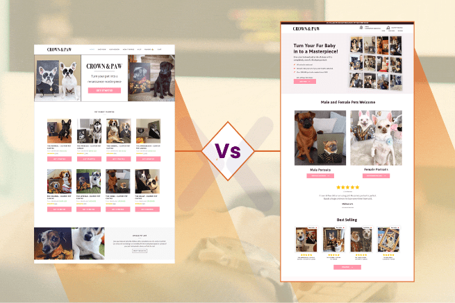
The best way to understand the Landing page is to compare it with the product page.
Landing pages are constructed and optimized for conversion purposes, while Product pages are mainly for informing.
Therefore, each page utilizes different characteristics to support its ideal goal.
Overview of the differences between product pages and landing pages:
Landing Pages
- It has 1 clear CTA
- Additional pathways such as site navigation are removed
- Content is written for one goal
- Optimized for marketing campaigns
Product Pages
- It can contain multiple CTAs
- Additional pathways are added, such as site navigation and product categories
- General content is written for different goals
- Optimized for SEO to attract traffic
Key points to create a high-converting landing page
Define the goal of the page
You need to outline your goals ahead before creating a landing page. This will help you describe the sales message you are passing to visitors. It also helps you specify the design of the landing page corresponding to the goal you set. For example, you can use the squeeze page specifically if you aim to get the user’s email. Squeeze is a shorter page designed for getting visitors to subscribe.
Create a captivating headline
A headline is the first thing visitors view on the landing page. The attention, the interest, and everything starts with the headline. Therefore, the headline must be clear and direct to what the message upholds to keep visitors on your site and make them inquire for more information. The headline is what first motivates visitors to hang around and search more about what service you are offering.
The headline should get the user’s full attention and enlighten the readers about the product. It should be attractive, short, and not more than 20 words. Targeting your audience’s needs while stating the headlines would be best. The headline should be set up so that as soon as visitors land on the page, they know what service you are offering.
Use Persuasive Subheading
A persuasive subheading is one of the ingredients you need to create a significant landing page that can spice up your eCommerce business. If your headline can persuade the visitors to look, then your subheading should make them stay long enough. The subheading should have convincing features and more in-depth details than the headline. For you to get conversions, you should deeply understand your customers’ needs. Target what features your customers are curious about, and also talk about the benefits of the products and how they will satisfy their intention if they buy them. This will help you provide the features that interest your customers, thus improving conversions.
Use high-quality images and videos.
Generally, humans tend to be moved by what they view, mainly images. You can attract visitors to your page with an impressive image. The colorful and alluring images can set an excellent first impression on visitors. This helps heighten the possibility of visitors staying on the page and reading through the content. Some products can be complex for users to comprehend. To spice it up and make it easier for visitors to understand, you can add an interesting video that explains the product sufficiently.
Include a clear CTA button
Including a CTA (call to action) button on the page helps convince users to finalize the action you set for them. These CTA buttons must be attractive and also outstanding before other features. The message should be straightforward, indicating whatever will occur if users go on to click on the CTA button.
Build up your trust with testimonials and reviews
Pleased clients are the best proof any store can have to market the product’s value. Most of the time, before we use or purchase a product or service, we first verify the product’s value by searching other people’s reviews. Showing customers’ opinions or reviews on your product is a valuable way of building trust between you and your customers and generating revenue.
Conclusion
To boost your online store business, you need to make good landing pages that can attract visitors and give them what they want.
With this information, now you are set to create that landing page for your eCommerce store to improve conversion and generate more revenue.
