A social media landing page is often linked to your social media profile or ad campaign. Your social landing page could be used for several purposes. For instance, generating leads, promoting special products, or even getting registrations for your special events.
In the hustle of attracting customers, your social media landing page may come in as a second thought. But, that shouldn’t be the case— your landing page is a powerful tool that you can use to push potential customers into your sales funnel.
So, we’re here to show you six effective ways to boost your online store conversion through an optimized social media landing page.
Ready? Let’s dive in!
1. Embrace simplicity
Keep your landing page simple for a better visitor experience. A clean design with minimalistic elements ensures clarity. Avoid overwhelming colours and opt for easy-to-read fonts.
Make good use of white space as this will provide visual relief to your visitors. Doing this can prevent your landing page from feeling crowded and create a good user experience. You also want to ensure that your content is well organized. Especially in cases where you wish to display products on your landing page.
Use plain English in your copy so that a general audience can understand what your page is about.
For example, Warby Parker’s SM landing page for booking an eye exam is quite straightforward. You’ll only find relevant information here. See how the design is well-detailed and does not contain unnecessary elements:
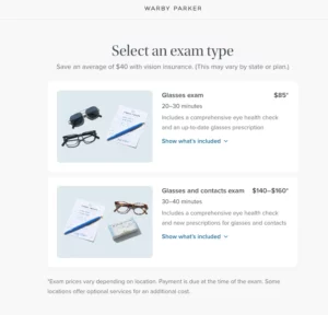
A simple design gives your page a nice touch. It also makes it easy to guide your target audience smoothly through the content on your landing page.
2. Maintain a unified brand message
According to statistics by Zippia, a consistent brand presentation can increase revenue by 33%. That tells you how important it is to have a unified brand message.
Consistency builds trust and reinforces brand identity. Here’s how this works: when visitors encounter your message across various platforms, it makes it easier for them to recall. This can also go a long way to strengthen the connection they have with your brand.
Having a unified brand message is also helpful in cases where you may want to employ PR services in your social media campaigns or overall marketing efforts.
So, ensure that you maintain a consistent brand message across your landing page and social media posts. Ensure alignment in word choices, brand voice, and other elements— even visual. For instance, if you look through Patagonia’s social media platforms, you’ll notice that they take an inspiring tone of voice and focus on sending an emotional brand message. The same goes for the landing pages they create.
See this Instagram post and landing page about choosing gifts for kids:
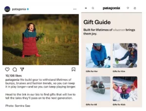
Lastly, a consistent message across your online platforms instils confidence and fosters a seamless transition for users— especially when they’re navigating from your social platforms to the landing page. Think of it as a strategy for creating a cohesive brand experience.
3. Optimize for seamless mobile experiences
Optimize your landing page for seamless mobile experiences, recognizing the prevalence of mobile usage among users. Statistics also reveal that a significant portion of online traffic comes from mobile phones.
To enhance the mobile experience, prioritize responsive design and mobile-friendly features. Ensure that the layout adapts seamlessly to various screen sizes. This helps to ensure easy navigation for users.
Here are some other things to look out for when optimizing your SM landing page for mobile users:
- Images and visuals: optimize image sizes and visual content for quicker loading on mobile devices. Consider using tools like TinyPNG or ImageOptim for compressing images without compromising quality.
- Forms: if your landing page includes forms, streamline them for mobile users. Use fewer form fields and ensure they are easy to complete on a smaller screen.
- Navigation: simplify navigation by using clear menus and intuitive buttons. For product pages, make it easy for mobile users to find what they may be looking for without excessive scrolling.
You also want to consider using a good hosting provider that offers an integrated CDN (Content Delivery Network), which distributes your site’s content across multiple servers. This can make your landing page more responsive across devices and help to improve load time.
By catering to your mobile audience, you’ll be better equipped to access a vast user base and provide a user-friendly experience. In turn, this can contribute to improved engagement and conversion rates for your landing page.
4. Include a powerful call-to-action (CTA)
The whole point of having a landing page is to generate leads for your e-commerce business. So, consider using a powerful call-to-action (CTA) to drive conversions effectively.
CTAs play a pivotal role in guiding visitors toward desired actions. Keep them simple, avoiding unnecessary complexity. With your call to action, be specific about what you want your landing page visitors to do.
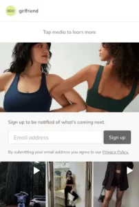
Typically, your call to action will depend on the purpose of your landing page. For instance, if you want email sign-ups, simply saying “Sign up” will do, bearing in mind that the copy should clearly emphasize this prompt. See the example on Girlfriend Collective’s landing page. It not only uses a clear “Sign up” call to action but also adds a contextual layer by including a “Verify Email” step in the user journey, under the pretext of privacy settings for added security and authenticity. This additional verification step is important in maintaining a clean and engaged email list.
For Royal, we can see that the electronics store has a dedicated landing page aimed at getting leases to download their product catalogue— hence, the call to action is in the example below.
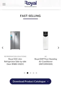
Also, ensure that your call to action button is prominent and easy to find on your social landing page. It’s best if you have one major call to action. This way, you avoid confusing your leads.
Clear and concise CTAs can enhance your customer journey and encourage swift responses. That’s how you can easily get instagram followers, X followers, as well as other social media users, to enter your sales funnel— making your landing page more effective.
5. Regularly test your landing page
Regularly testing your landing page is crucial for ongoing improvement. Use A/B testing to compare different versions and determine what resonates best with your audience.
When testing your SM landing page, focus on key elements like:
- Headlines: You can use different font types for your headlines to see what works best. Or, switch up the copy a little bit.
- Design: Consider trying out different images or colour combinations for visual elements on your page.
- Layout: try to arrange the elements on your page differently.
- Call to action: Try placing them in different locations to see which yields better results. Or, try using different colour highlights.
- Copy: Try out different captions and see what your social media audience responds to better.
When running an A/B test, you want to focus on one landing page element at a time. For instance, instead of testing both the headline and call to action at once, you could test the headlines first. Then, test the call to action after that. This way, you’ll be able to tell which changes are bringing specific results.
Continuously test and optimize your landing page, keeping an eye on metrics such as conversion rates, bounce rates, and user engagement. Depending on the landing page builder you use, you should be able to assess these analytics on a built-in dashboard. Alternatively, use Google Analytics.
Pay attention to user feedback and behaviour to identify areas for enhancement. Occasionally, you can change things up a little and see if they bring any improvement to your landing page.
By iteratively testing and refining, you ensure that your landing page remains effective and aligns with the evolving preferences of your audience, ultimately maximizing its impact on conversions.
Conclusion
A compelling landing page can help to convert regular social media followers into loyal customers. That’s why you should not ignore the need to create or optimize an existing one for better results.
As we’ve seen today, building a compelling social media landing page hinges on six best practices. Let’s recap.
First, embrace simplicity by ensuring the page has a clean design and easy-to-understand copy. Also, maintain a unified brand message across social channels. This makes connecting with your brand across platforms easier for your social media audience. It’s how you create a consistent user experience too.
Next, optimize the page for seamless mobile experiences and include a powerful call-to-action (CTA) that is straightforward and prominently placed. Finally, regularly test your landing page. You can start with an A/B test to see what your target audience likes. Then, continue to check for opportunities to improve your page.
Now, it’s over to you. As you put these tips to use, you’ll be well on your way to building high-converting landing pages for your social media marketing efforts. Good luck!
