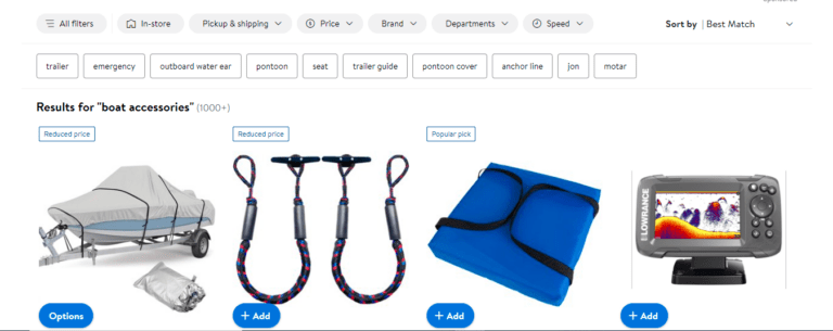
A simple, user-friendly search tool is essential for any successful eCommerce site. People will not buy your products if they can’t find them. A poorly built search bar can trouble the users to the point where they abandon your brand in favor of a competitor. User Experience is critical in eCommerce because it assures that customers can quickly explore your website, locate what they are looking for, make a purchase, and so on.
What factors contribute to a positive shopping experience in online stores? Speed, relevance, and usability are all important considerations for a search UX. Even if your on-site search works flawlessly, users will leave and never return if it is inconvenient. You can not just rely on your products to sell themselves if you want to sell online. You must provide a good user experience (UX) that makes it simple to purchase and encourages them to buy frequently.
How to design eCommerce Search UX for your website?
If you run an eCommerce website, you must be constantly concerned with how to develop your website as one of the most powerful weapons for scaling up your business. A website that can effectively generate sales must first provide a good user experience (UX). In other words, an online business owner with a website must prioritize UX design to make it simple for consumers to interact with the brand and meet their needs. In short, provide meaningful and relevant experiences to the users.
Here are a few things to think about when creating an eCommerce website.
Structure of Categories
Categories are part of the product catalog hierarchy and should describe the product. It should give an idea of what the product is. Product types should be used as filters – not categories.
Filters vs. categories
Categories and filters are not mutually exclusive. Filters should be applied to the type of products rather than categories. For less than 30 items, consider using the category as a filter.
Sub categorization
To avoid overwhelming the user, keep subcategories to a maximum of ten per category. Target at least ten products at the most granular category level.
Auto complete design
How autocomplete suggestions can help and guide consumers to better search queries demonstrates the value and impact of the user experience. This frees up the user’s attention to focus on the outcomes.
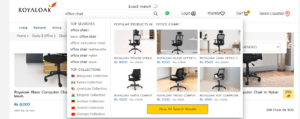
Make the widget stand out
To add depth to the page, use a subtle border or shadow. This allows the user to concentrate on the results. Include a search history or a list of the top searches. Consider using a distinct style to indicate previous search history. This adds value to the user’s experience.

Scroll with the arrows and select with the ‘enter’ key
Let the consumers use the arrow keys to navigate the list and the enter key to select a suggestion.
Avoid using a scrollbar
Instead of a scrollbar in the autocomplete widget, ensure that it simply expands to show all potential suggestions, providing a better and easier-to-navigate experience for the user.
Limit suggestions
Display no more than ten rows of suggestions on the desktop version and 4-8 on the mobile version. When the user is typing longer queries, autocomplete suggestions should be requested for every keypress after two letters are typed, with a keypress delay of about 50-150ms to avoid flickering.
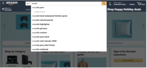
Highlight the differences
Instead of emphasizing what the user has already entered, consider highlighting the differences in the search.
Never use results to replace query suggestions.
Autocomplete results are product suggestions that take you directly to the product page. The autocomplete query suggestions take you to a standard search results page. Autocompleting results can supplement autocomplete query suggestions, but they should never be used in place of them.
Include the scope
While searching, copes allow the user to narrow their search options. Consider scopes to be store aisles. Consider highlighting scope with a distinct color and including “In” to clarify that it is about the scope and not the query suggestion.
Filters and aspects
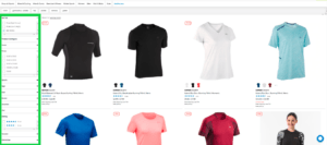
Filters make visible certain product metadata that visitors can use to refine their search queries. Faceted filters take it a step further by allowing users to narrow results by multiple dimensions simultaneously.
Design of a product list
Designing search result list items is a balancing act between including the necessary product attributes that most users will require while not overwhelming the list with so much information that users become discouraged from exploring. The thumbnail should consist of common attributes such as price, variants, ratings, title, price, and image.
Design of a search box
Make the search box visible by using an open text field followed by a search button. The use of a link element that opens a search field should be avoided. Include text in the search box that is helpful, such as “search for products, categories, or brands.” When the user begins typing, the text should vanish automatically.

Associated outcomes
Product discovery is aided by related results, which help to increase Average Order Value. With associated results, you can map the relationship between products to automatically generate a complementary list of relevant results – results that would never have been discovered using a simple text-matching search.
Customize your eCommerce search UX with ExpertRec
ExpertRec now makes it simple to customize your eCommerce search UX. We make it simple to find your eCommerce store with our custom search solution. As a result, you can always get higher search CTRs and conversions while making the most of your search bar.
You can use our customized eCommerce search UX service to:
- Assist customers in finding products quickly and easily.
- Simple installation, quick search, and a lovely experience
- Provide a customized search experience
Our Ecommerce Search UX expertise includes:
- Fast search results
- Spell checker
- Facets and Filters
- Merchandising
- Compatible for all platforms
- Supports 30+ languages
FAQ
What is UX in eCommerce?
User experience design aims to get inside your end user’s head and figure out what will provide them with a simple, logical, and enjoyable shopping experience.
Why is UX important for eCommerce?
The user experience of eCommerce websites can create a shopping experience that customers will remember and lead to increased engagement, loyalty, and purchases. UX is critical in eCommerce because it ensures that your customers can easily navigate your website, find what they need, and make a purchase.
Customers will buy from you more frequently if you make it easy for them to do so. Thus, you need to ensure that your website or mobile app provides the best user experience possible.
How do you optimize UX design for eCommerce stores?
Here are some practices that can assist your eCommerce store increase conversion.
- When designing the Hero Area, go for minimalism.
- Use a Well-Positioned Search Bar to Ensure Convenience Product Images in High Resolution
- Maintain Information Accuracy and Clarity.
- Give Priority to Larger Font Size
- Product Thumbnails are Required
- Bold Headlines to Capture Attention
- Focus on Content Optimization
- Offer an Overall Personalized Experience
- Segment Catalogue into Categories
[saswp_tiny_multiple_faq headline-0=”h2″ question-0=”What is UX in eCommerce?” answer-0=”User experience design aims to get inside your end user’s head and figure out what will provide them with a simple, logical, and enjoyable shopping experience. ” image-0=”” headline-1=”h2″ question-1=”Why is UX important for eCommerce?” answer-1=”The user experience of eCommerce websites can create a shopping experience that customers will remember and lead to increased engagement, loyalty, and purchases. UX is critical in eCommerce because it ensures that your customers can easily navigate your website, find what they need and make a purchase. Customers will buy from you more frequently if you make it easy for them to do so. Thus, you need to ensure that your website or mobile app provides the best user experience possible.” image-1=”” headline-2=”h2″ question-2=”How do you optimize UX design for eCommerce stores?” answer-2=”Here are some practices that can assist your eCommerce store increase conversion. When designing the Hero Area, go for minimalism. Use a Well-Positioned Search Bar to Ensure Convenience Product Images in High Resolution Maintain Information Accuracy and Clarity. Give Priority to Larger Font Size Product Thumbnails are Required Bold Headlines to Capture Attention Focus on Content Optimization Offer an Overall Personalized Experience Segment Catalogue into Categories ” image-2=”” count=”3″ html=”false”]
