Irrespective of the eCommerce website that we take into question, the primary intent is to bring the customers to the shopping cart. The transition has to be smooth, or else, the customers will lose their intent to shop at your store and seek a competitor’s services.
A category page is something that online merchants seldom pay attention to. But, surprisingly, the category page plays an important role in this regard.
A well-designed category page will not just help you with sales and upsells, but also induce some impulse purchases.
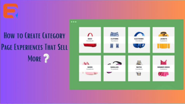
Primarily, category pages have been put in place to help with sorting and organizing the products on sale. They aid consumers with browsing products based on their any characteristics.
When consumers come across a host of relevant products, they can choose better and buy what meets their interests.
The creation of category pages will vary by the online merchant. But let us take a look at the rules not to be ignored in this regard.
1. Go visual
At the category stage, a customer is going to respond more positively to a product’s visual display because imagery works at an emotional level. He won’t be paying as much heed to the written content or the features.
Further, with the images on display, finding what he seeks becomes easier for the consumer. So, larger images work better for the category stage, not thumbnails. To center down on the optimal strategy, testing is a recommendable practice.
Most workable features of the product should be visible on the image. For a tomato chopper, its knives and chopped tomatoes should be shown.
2. Search functionality
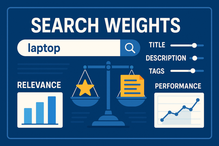
Including search functionality for your category pages is a must and works on many planes. Firstly, too many choices available on the category page will confuse the visitors. Search functionality, on the other hand, makes the page more manageable to let a consumer search for precisely what he seeks.
Another important application of search functionality on category pages is that it delivers worthy data for analysis in the form of consumers’ search terms. This data will yield actionable insights like unmet demands in product lines and the placement of products.
3. Sorting and filtering
Sorting and filtering functionalities on category pages bear some similarities with the search functionality. A consumer gets to prioritize the products based on his main interests. This could be displaying products brand-wise, sorting them by price, or seeing only the products that fall within a certain price range.
A consumer could, further, sort the products by parameters such as color or country of origin. Then, tracking the products based on consumers’ sort criteria will deliver insights into what they seek.
4. Quick view capabilities
The ongoing trend in the eCommerce industry is such that if category pages have quick view capabilities, visitors add more products to their carts.
This works just like first, a visitor browses down a category page. When he hovers his mouse pointer on a product that he likes, a larger image of the product is shown. The consumer gets a fair idea of what the product is all about and adds it to his cart.
