


Suppose, you are searching for a website and the website is not opening because of server issues or any other reasons. What do you see there, then? Yes! A 404 error page. Think if the page is designed well with funny quotes or animated figures, don’t you feel good? Yes, we know that you surely do. So, even 404 error pages can’t be ignored when it comes to marketing and customer experience.
Companies highly underestimate 404 error pages. They don’t know that it can make the people, who have opened the wrong page, stay on your site. If it is optimized well, the people can even sign up for emails and even turn into buyers! Let’s look at some examples where you can also turn visitors on your 404 error page into potential buyers, making them stay.
Some Examples of Best 404-Page Marketing
Some of the best 404-pages are mentioned below –
1. Amazon
When you land on Amazon’s 404-page, you see a picture of a dog. They show the dog’s name and link other dog-related articles they have. Along with that, there’s a search bar on top to search the products for which you visited the site. Isn’t it great!

2. Ikea
When you land on a 404-page of Ikea, you’ll see figures made out of things the brand sells. It is accompanied by a simple message and a link to their home page. Ikea offers a very brand-friendly, straightforward design which helps to connect the customers back to the homepage.

3. eBay
When you look at the 404 error page on eBay, it is very simple but effective. It has a direct link to the home page. It also offers a search bar displaying deals that are on trend. Showing trends creates an atmosphere of fear of missing out, which makes visitors check out the bargains. Using this way, they convert visitors into customers.

4. Snapdeal
When you land on their error page, Snapdeal shows you a game with the eyes of the person rolling toward your cursor. It is, indeed, attention-catching. What’s more interesting is that there are also shelves arranged with links.

5. Myntra
Myntra has a wishlist option, a cart page link, a profile link, and a search box link on their 404 error page. It highlights 404 to show what you have been searching for immediately might not be there. Instead, they offer links to their category links so that the customers quickly find the things they want.

6. Headspace
When you see the error page of headspace, they have an animated face rhythmically breathing in and out. It matches their products and what they promise to deliver, i.e. calmness from stress. The animated movement of breathing in and out also captures the viewer’s attention.

7. BigCommerce
Their 404 page has the tagline “Lost In Cyberspace?”. Then, there are links given for visitors. What’s interesting is that they provide the option of booking a demo or contacting them directly from the error page.

8. Squarespace
The error page has a black background with a game of finding lost alphabets, which keeps many visitors entertained by moving them here and there with the cursor. Along with that, they provide links for people who don’t want to play and, instead, may want to learn about websites, domains, templates, and other such things.

9. Volusion
Volusion has animated balls falling from top to bottom. After the balls fall, 404 is shown. Additionally, it contains the link to the home page. The colors of the balls falling merge with the color of their logo, which can make a visitor go wow. It is a calming yet very amusing design.

10. Le Singe
The 404 page here is shown in the dark. As the cursor moves, a light emerges in the direction the cursor moves towards. The viewer can either use the chat system to talk with the support team from the error page or use the links.

11. Nespresso
The error page shows a black background focusing on a cup of coffee. Along with that, they have a “click here” option to redirect you. Along with that, they list down different variants of coffee. The focus on coffee makes the unpleasant experience of landing on the wrong page better.

12. Etsy
The Etsy error page shows a confused woman holding a sweater with a ball of wool on the floor with a “how to knit” instruction book. There is a search bar along with a redirect link that would take you directly to the homepage.

13. Munchkin
The error page has a picture of an upset baby along with information and customer care details and a box for an email subscription to get exclusive rewards. On top of the page, there’s a search bar alongside different categories. This design definitely attracts the viewers.

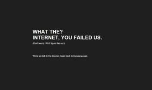
14. Converse
The error page is minimal, without any pictures. It has a black background and a funny quote written in bold white font with a link to the main page.

15. Otterbox
The 404 page has a picture of an animal standing with a sad face with a funny quote about neither the unicorns nor the page existing and placing a search box after feeling optimistic quote. On the side, they have a ” Need Help” link too.

Summing Up
When you look at some of the best examples of 404 error pages from brands, apart from the standard redirect link and search bar, you can see the different tweaks they have given. This also forms a part of their branding and impresses a viewer. While many brands show a bland redirect message, these brands have gone beyond that to keep the viewer entertained. While some have focused on minimal impact, others have used vibrant colors. Some of them have also used funny pictures with even more humorous quotes. Some have added sections and photos and proceeded with listing their products. And, many have added all of them along with showing deals. So if you have a website, start following their examples and converting visitors into customers!


