We at Expertrec provide Enterprise grade search for websites. We had built a custom search solution which will allow users to provide a search of their website. This helps people to find the content much more easily. It is like Google Custom Search but ad-free. Users have to add the code or the install plugin for WordPress on their websites and they will have a beautiful site search on their website.
The main purpose of it have information easily accessible to the end user, but if we didn’t incorporate the accessibility guidelines it kind of defeat the purpose. As we will be keeping a large number of user base unable to access the content. Our solution only consists a part of the actual website but its content regardless of an original website will be accessible to almost all users.
In the following article, we would like to take you through the overall concept of accessibility, why it is needed, some helpful tools
and how it can be achieved for search.
What is accessibility
Accessible web design is about making sure web pages are not constructed in ways that inadvertently create barriers, making it difficult or impossible for some people to access the pages’ useful content. These barriers can be the result of not using the features of the underlying HTML code as they are intended, or assuming that all people will ‘see’ our pages as we see them.
People view web-pages on all kinds of hardware and software like PCs, laptops, tablets, personal digital assistants, mobile phones.
People with certain disabilities such as dyslexia, blindness or partial sight, may use Assistive Technology Devices such as screen readers, screen magnifiers, make adjustments to the settings on their browsers, text readers, speech input software and others.
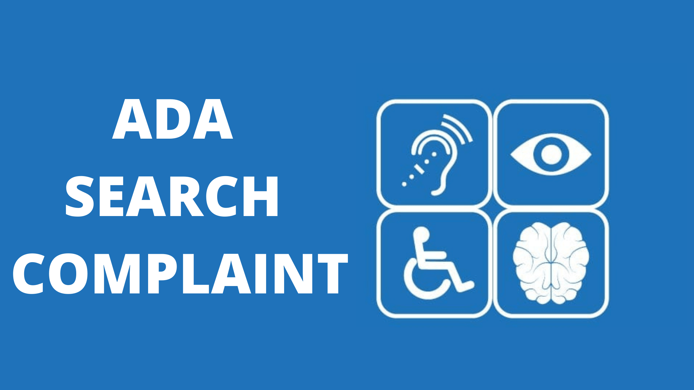
The main groups, how they use the web and how the careful designer can improve their user experience
- Visual Impairments-People in this group can have mild or moderate vision impairments in one or both eyes, color blindness, low vision, blindness or deaf-blindness. In many cases, there is a need to change the presentation of the web content to adapt it to their needs. They require the ability to resize text size and images and to customize fonts, colors, and spacing to increase readability.
- Auditory Disabilities-Web users who suffer from hearing impairments of different grades can’t always understand speech, especially when there is a background noise. The most frequent use case here is video content, that needs to be made accessible by adding visual assistance to the audio part.
- Cognitive and Neurological Disabilities-Disorders related to the brain or the peripheral nervous system impact how people move, see, hear and understand things. There are many people who need to process information slower than others, so we need to provide them with clearly structured content that facilitates orientation.
- Physical Disabilities-Physically disabled people can have motor disorders, limitations of sensations or muscular control, joint problems, missing limbs, and can face many other physical impediments. Probably the most important thing related to them is always providing full keyboard support, and giving enough time for them to complete tasks such as filling online forms, replying to questions or editing their previous content in comment sections.
Why it is needed
It is a legal requirement:
It is mandatory in some countries like the U.S and Europe and in others, there are no legal obligations yet.
The legal obligations on us mean we must take steps to anticipate and prevent predictable barriers to access to information and services on the website by making appropriate adjustments to avoid potential problems for access response to the needs of particular individuals who make known to us any specific barriers they encounter when trying to access web-based information and services.
It is a social issue:
Making information accessible to this wider audience through an accessible website helps to further one of the key strategic themes – to be ‘tolerant, humane and liberal-minded, with the pursuit of truth, openness and equality, and diversity at the heart of what we do’. It is essential for our equality and diversity, which is also an important aspect of our social responsibility.
It makes our pages more usable for all users:
Accessible websites are more easily navigable, more flexible and easier to understand. Improving web accessibility has been shown to result in web pages that are more easily findable by search engines. This makes pages more effective both for your internal search and in the wider web, thereby also increasing the number of users to whom our pages are available. Increased usability means site allows users to achieve their goals efficiently, effectively and satisfactorily.
It makes good business sense:
By making sure that the meaningful content is available to as wide a range of users as possible, we can maximize our audience reach, and thus potentially reach a wider market. Greater compatibility and future proofing can help web pages remain accessible as browsing software and web standards change, saving on work needing to be done to amend sites in line with such developments. Simpler, cleaner code and content make pages easier to maintain. If users have a positive experience of the site they are more likely to use it thoroughly, return more often and tell others about it.
It improves site’s technical performance:
For example, the use of stylesheets for presentation and proper markup for content outlined in the guidelines means pages load more quickly, as page file size is reduced, and when developing new pages in the corporate template time and effort is also saved on design. Pages will work more reliably across different browsers and older technology if they are constructed according to published technical standards.
Accessibility Guidelines — WCAG & WAI-ARIA!
The Web Content Accessibility Guidelines, often abbreviated to WCAG, are a series of guidelines for improving web accessibility. Produced by the World Wide Web Consortium (W3C), the WCAG is the best means of making your website useful to all of your users.
Web Content Accessibility Guidelines (WCAG) 1.0:
The W3C’s first incarnation of WCAG in 1999 was a huge leap in web accessibility, bringing together years of useful work by developers from across the world. The Web Content Accessibility Guidelines 1.0 had 14 guidelines and divided them into 3 priority levels:
- Priority 1 – the most basic level of web accessibility
- Priority 2 – addressed the biggest barriers for users with disabilities
- Priority 3 – significant improvements to web accessibility
Web Content Accessibility Guidelines (WCAG) 2.1:
The current set of guidelines has been in force since 2008 and will run for many years yet. The guidelines are more technologically neutral than WCAG 1.0, allowing them to stay useful for longer. Latest changes are introduced on 05 June 2018
The principles of WCAG 2.0 are:
- Perceivable
- Operable
- Understandable
- Robust
There are 3 levels of conformance with WCAG 2.0: A, AA, and AAA
- Level A: A Web content developer must satisfy this checkpoint.
- Level AA: A Web content developer should satisfy this checkpoint.
- Level AAA: A Web content developer may address this checkpoint.
For the website to be ADA compliant it should meet WCAG 2.0 Level AA success criteria (which include Level A criteria), and address the issues needed for your digital content to meet them.
Although they are not an all-inclusive list of issues facing web users with disabilities, they are internationally recognized and adopted standards. The guidelines explain how to solve many of the problems that your users with disabilities face.
You could read all about how to meet WCAG requirements using this quick reference guide — WCAG 2.0 Quick Ref
WAI-ARIA:
The Accessible Rich Internet Applications Suite is a framework to make Web content and Web applications more accessible to people with disabilities. It especially helps with dynamic content and advanced user interface controls developed with Ajax, HTML, JavaScript, and related technologies. You can read more about ARIA here.
Some helpful tools
Accessibility developers all around the world had open sourced some of the best tools and frameworks to bring awareness early in the development process. There are many websites where you can put your URL and it will give you accessibility reports. There are tools which will help while you are in development phase and you can include it in your CICD environments.
Here’s a small set of tools that’ll come in handy during development:
- HTML Code Sniffer is an excellent Chrome extension that comes with accessibility standards to enforce three conformance levels of the Web Content Accessibility Guidelines (WCAG) 2.0, and the web-related components of the U.S.”Section 508″ legislation.
- For Android applications, ‘Accessibility test framework’ provides libraries for automated accessibility checks — For a given view, libraries run all accessibility checks on all views in the hierarchy rooted at that view and throws an exception if errors are found.
- WAVE — Web Accessibility Evaluation tool with chrome and Firefox extension is developed by WebAIM.org. It provides visual feedback about the accessibility of your web content by injecting icons and indicators on your page.
- For ReactJS users, react-a11y is an excellent runtime analysis tool to identify accessibility issues in react.js elements: react-a11y
- Axe-Webpack-Plugin — Axe has published webpack plugin to be integrated into development server. Each time webpack finishes compilation, the aXe accessibility rule-set will be run against the app
This list can grow endless. There are no shortage of resource to make your website accessible, just a will and small efforts from your side.
Accessibility for search
The aria-label attribute is used to define a string that labels the current element. Use it in cases where a text label is not visible on the screen. If there is visible text labeling the element, use aria-labelledby instead. This attribute can be used with any typical HTML element; it is not limited to elements that have an ARIA role assigned.
Using aria-label and role we can improve accessibility greatly with AT.
SEARCH BOX:
What’s the purpose of this input? The user will have no clue that this is a search input. This is very bad and confusing. As a result, your user will be frustrated and not happy with that.
Few things as a user should be able to achieve with given search box
- able to search by using the keyboard.
- should be informed if that the field is required.
- know when the field status is invalid.
- should be able to search by clicking Enter key on the input.
- need to know what is the purpose of this input(as there may be other input boxes present on the webpage)
When we don’t have an <aria-label> element, AT (Assistive Technology) users won’t get the meaning of this input, even if there is a placeholder attribute. It is necessary to provide for the search icon we used. We can also achieve this by providing a label which will be hidden using CSS but a screen reader will able to correctly convey user that this is a search box.
<div id="er-search-form" role="form">
  <input type="text" title="Search" tabindex="0" name="" aria-label="search input" role="searchbox" id="er_search_input_dummy" placeholder="Search" autocomplete="off">
  <button role="button" aria-label="search by voice" type="voice" class="er_voice_search_dummy" onclick="_er_voiceService.startRecognition()">
  <i class="fa fa-microphone"></i>
  </button>
  <button type="button" title="Search" tabindex="0" id="er_search_button_dummy" aria-label="Search">
  <i class="fa fa-search"></i>
  </button>
</div>
Handling of errors:
In case the user didn’t enter anything in the field and pressed on the button, it should inform AT that this input is not valid and/or required. Many designers have a habit of showing error with red color and success with green color. Which is a standard convention to give feedback but for accessibility purpose it is not a sufficient one. For blind or color-blind people that will be completely useless and they will be left wondering what happened. It should we clearly mentioned if an error was occurred in given output or input was missing.
SEARCH RESULTS:
Search results generally consist of text snippets and images related to the search query. We should able to access our search content with the help of keyboard. With a keyboard: Press the Tab key until you reach the link you want. Then press the Enter key. All images present as a result should have appropriate alt tag. Animation should be kept as the minimum so it should not cause distraction or inconvenience for the user with disabilities.
<div class="er-search-result-box" aria-label="Search Results">
  <div class="er-search-result-top_section" aria-label="search result heading">
  <div class="title" role="heading" aria-label="search result title">
  <a href="http://dev.iguanacall.com/" tabindex="0" target="_blank">Home | IguanaCALL - Cloud-Based Business Phone Systems</a>
  </div>
  <div class="url" role="link" aria-label="search result url">
  <a href="http://dev.iguanacall.com/" target="_blank">http://dev.iguanacall.com/</a>
  </div>
  <section class="er-micro-data">

  </section>
  </div>
  <div class="image"><img alt="search image" src="//lbr-searchv7-euwest.expertrec.com/img/v1/aHR0cDovL2Rldi5pZ3VhbmFjYWxsLmNvbS8.jpg" onerror="this.parentElement.style.display = 'none'"></div>
  <div class="text" role="text" aria-label="Search result snippet">
  Unlimited Extensions Get all the extensions you need Auto Attendant
Your <span class="highlight">virtual</span> answering machine with corporate image
Call Recording Record all the phone calls for your control Discover and enjoy the multiple functions on Demand offers you
More features: APP Softphone , Music on Hold , WebRTC , Dial-by-Name Directory , Call Block , Fax-to-Email , Caller ID , Simultaneous Rings
and more… With on Demand you get phone lines and extensions with advanced features that contribute to your business.

  </div>
</div>
As you can see in above code block use of alternative text available Image and appropriate aria-label to specify the context.
Make all functionality available with a keyboard: Make sure all interactive elements are accessible (and controllable) by keyboard, focused elements are highlighted, and the tab order actually makes sense. Press the Tab key until you reach the link you want. Then press the Enter key go to that link to see results. We can managed this using tabindex property as shown in following code.
<ul role="navigation" style="margin: auto" aria-label="Page Navigation">
	 {{#if showPrev}}
	 <li tabindex="0" onclick="_er_config.paginator({{currentPage}}-1)" role="link" aria-label="Go to previous page" class="er-paginator-previous">{{prevText}}</li>
	 {{/if}}
	 {{#each items}}
	 <li tabindex="0" onclick="_er_config.paginator({{this}})" role="link" aria-label="Go to page {{this}}" class="er-paginator-list" style="{{getCurrentPagination @root.currentPage this}}">
	 {{this}}
	 </li>
	 {{/each}}
	 {{#if showNext}}
	 <li tabindex="0" onclick="_er_config.paginator({{currentPage}}+1)" role="link" aria-label="Go to next page" class="er-paginator-next">{{nextText}}</li>
	 {{/if}}
	</ul>
Above code is about pagination where using tab key we can which page we want to go.
Another important thing is contrast should be correctly maintained between background and results. In our case, we provide user access to change CSS properties so they can set properties appropriate to their website theme.
Final Words
If we give users a choice about how they want to consume the online content, and carefully think about all the possibilities they might interact with our site, we increase the overall user experience of our design in a significant way.
Creating web experiences for disabled people is an excellent design practice. If we build a site that takes the needs of the sensory impaired into consideration, we design a product that is logical, well-structured and easy-to-use. This is not only good for the disabled but for every single user, as they have the same need for an intuitive and customizable website that is easy to understand.

