


You’ve guided a shopper all the way from homepage to cart. They’re interested, ready to buy, and just one step away from checking out. But then—they leave.
Sound familiar?
A major reason for cart abandonment isn’t indecision—it’s bad checkout design.
Your checkout page is the last thing a customer sees before converting. If it’s slow, confusing, or inconvenient, you risk losing sales. That’s why checkout design matters more than most merchants realize.
First Impressions Count—Even at the End
The checkout is your final chance to provide reassurance, speed, and clarity. This is where trust is either confirmed or broken.
Common design issues that drive users away:
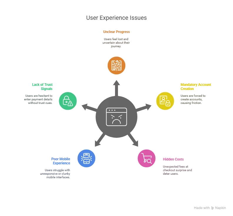
You might have the perfect product and pricing, but a single bad experience at checkout can undo it all.
What Good Checkout Design Looks Like
Good checkout design should remove all unnecessary friction. That means keeping it:
- Simple – Only ask for essential info
- Fast – Minimal loading and no unnecessary clicks
- Clear – Transparent pricing and next steps
- Trustworthy – Visual cues that build confidence (SSL badges, secure icons)
The best checkout designs are intuitive—users shouldn’t need to think, just flow through.
Key Elements of High-Converting Checkout Design
Here are the foundational components that improve conversion:
| Feature | Why It Matters |
|---|---|
| Guest checkout | Avoids blocking new users who don’t want to register |
| Progress indicators | Help users see how many steps are left |
| Mobile optimization | Ensures smooth navigation across devices |
| Auto-fill fields | Speeds up the process with saved info or address lookup |
| Clear error handling | Prevents frustration during form submission |
| Summary section | Allows users to verify and adjust details without restarting |
Tips to Improve Checkout Without Redesigning Everything
You don’t need to rebuild your site. Small changes can yield big results:
- Add a “secure checkout” badge near the payment field
- Enable express checkout options like Apple Pay or PayPal
- Minimize fields—use only what’s necessary
- A/B test your checkout button color, size, and wording
- Use a single-column layout to guide focus and reduce confusion
Looking for a Smarter Tool to Improve Your Checkout Design?
Great checkout experiences don’t happen in isolation—they’re supported by the rest of your site’s UX. If your product discovery and filtering are smooth, users arrive at checkout with more confidence and intent.
This is where tools like ExpertRec add value. While not a checkout tool itself, ExpertRec ensures the search-to-checkout journey stays seamless by:
- Making product discovery fast and intuitive
- Personalizing search results so users find what they need
- Avoiding dead-end “no results” moments
- Speeding up page load performance to reduce friction
A streamlined site experience means shoppers arrive at your checkout ready to complete the purchase.
Conclusion: Checkout Is Where Conversions Live or Die
You’ve done the hard work to get traffic. You’ve invested in beautiful product pages and smart marketing. Don’t lose customers at the finish line.
Checkout design matters because it’s not just a transaction page—it’s the last impression and the final trust test. Make it smooth, intuitive, and reassuring—and you’ll see fewer bounces and more completed orders.
Frequently Asked Questions
Checkout design refers to how the final payment and shipping step is structured and visually presented in an online store.
How does checkout design impact conversion?
A clean, intuitive, and fast checkout experience reduces friction and abandonment, improving your chances of closing the sale.
What’s better: single-page or multi-step checkout?
Single-page is often faster, but multi-step can work if it’s well-designed and shows progress clearly.
What’s the most common reason for checkout abandonment?
Unexpected costs (like shipping fees), required account creation, or a long checkout process are top culprits.
Can checkout design be customized on Shopify or WooCommerce?
Yes, both platforms offer apps and plugins that let you customize checkout fields, layout, and payment options.


