Read angular material autocomplete position for more information.
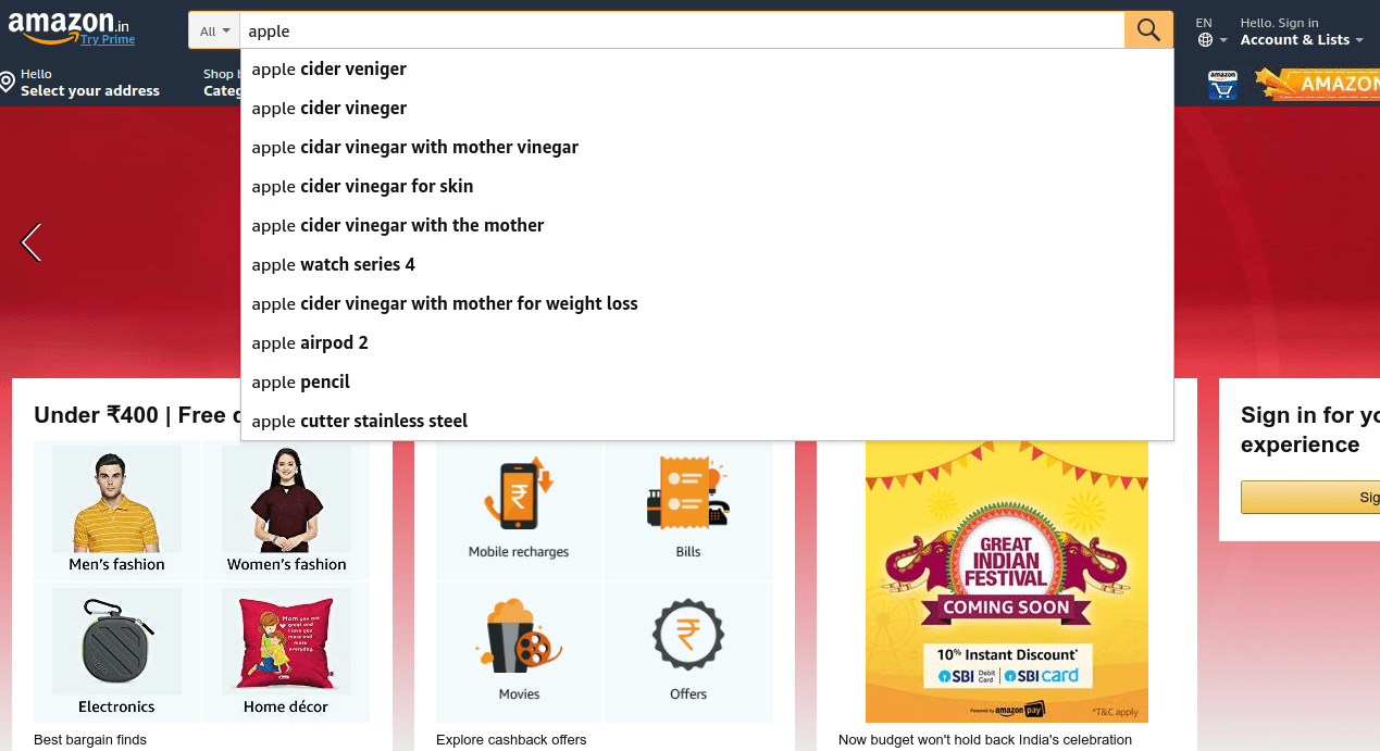
The autocomplete is a normal text input enhanced by a panel of suggested options.
Start by adding a regular matInput to your template. Let’s assume you’re using the formControl directive from ReactiveFormsModule to track the value of the input.
Note: It is possible to use template-driven forms instead, if you prefer. We use reactive forms in this example because it makes subscribing to changes in the input’s value easy. For this example, be sure to import
ReactiveFormsModulefrom@angular/formsinto yourNgModule. If you are unfamiliar with using reactive forms, you can read more about the subject in the Angular documentation.

Add a search with autocomplete to your website
<mat-form-field>
  <input type="text" matInput [formControl]="myControl">
</mat-form-field>
Next, create the autocomplete panel and the options displayed inside it. Each option should be defined by a mat-option tag. Set each option’s value property to whatever you’d like the value of the text input to be upon that option’s selection.
my-comp.html
<mat-autocomplete>
  <mat-option *ngFor="let option of options" [value]="option">
    {{ option }}
  </mat-option>
</mat-autocomplete>
Now we’ll need to link the text input to its panel. We can do this by exporting the autocomplete panel instance into a local template variable (here we called it “auto”), and binding that variable to the input’s matAutocomplete property.
my-comp.html
<mat-form-field>
  <input type="text" matInput [formControl]="myControl" [matAutocomplete]="auto">
</mat-form-field>

<mat-autocomplete #auto="matAutocomplete">
  <mat-option *ngFor="let option of options" [value]="option">{{option}}</mat-option>
</mat-autocomplete>


